Shifting to solution-first messaging for a SaaS CRO tool
Key results
Identified the limitations of Pathmonk’s feature-focused messaging and led a strategic shift toward solution-first storytelling, improving product knowledge and increasing recurring revenue.
74%
67%
demo requests growth in 3 months
website-driven revenue increase in 3 months

Project overview
Pathmonk, a CRO software platform, had long faced challenges in effectively communicating its value to prospects. When I joined as Head of Marketing in 2022, the commercial pitch was centred around “automated website personalization” a concept that many prospects found difficult to understand.
At the time, Pathmonk was marketed as four separate products—Accelerate, Intelligence, Retargeting, and Climate. However, fragmented messaging and a lack of cohesion made it hard for prospects to grasp what these products did or how they solved their problems.
The lineup itself added to the confusion: while Accelerate, Intelligence, and Retargeting targeted marketers, Climate was aimed at an entirely different audience. This disconnect weakened the overall narrative, leaving Pathmonk’s value proposition unclear and prospects uncertain about how it could help them.
Objective
From the beginning, my goal was to improve product understanding by tackling the confusion caused by feature-based messaging and overly technical explanations. The focus was on identifying the root causes of this lack of clarity and repositioning Pathmonk’s offerings to clearly communicate their value to marketers in a way that resonated with their needs.
Ultimately, the objective was to drive customer acquisition and boost revenue by ensuring prospects could easily understand and connect with Pathmonk’s solutions.
Strategy
Before drafting a strategy, I focused on identifying the underlying problem that prevented prospects from understanding Pathmonk’s value. My first steps were:
Conducted a thorough competitor analysis to understand how similar tools were marketed, discovering that the most successful competitors (with a couple of exceptions) framed their offerings as solutions to customer problems rather than standalone products.
Gathered insights from real prospects and discussions on platforms like Reddit and Quora to identify common pain points marketers faced and the language they used to describe their challenges.
It quickly became clear that prospects weren’t interested in concepts like “website personalization”—they cared about “increasing leads” or achieving other tangible outcomes. It wasn’t about explaining how the technology worked but clearly communicating what it could do for them.
With this insight, I began to rethink how Pathmonk’s value proposition could be reframed:
Simplifying the offering: Climate, which wasn’t contributing to business opportunities and cluttered the product lineup, needed to be removed. I proposed streamlining the focus to align all products with the core audience of marketers.
Unifying the platform: To avoid the fragmentation caused by marketing new features as separate products, I suggested repositioning Pathmonk as “your all-in-one marketing platform to increase revenue.” This approach centred the messaging on outcomes rather than individual tools.
Creating industry-specific pages: Recognising that conversion goals differ widely between industries, I proposed tailored landing pages to replace the ineffective generic approach. For instance, SaaS companies prioritise generating leads or trials, while e-commerce businesses focus on boosting sales.
Building on these ideas and leveraging the pain points research I had conducted earlier, I mapped out the specific problems Pathmonk could solve. By cross-referencing these pain points with Pathmonk’s features, I identified nine distinct solutions—such as “Increase lead generation,” “Improve lead quality,” and “Optimize paid acquisition ROI”—that directly addressed marketers’ needs.
To make these solutions compelling and easy to understand, I oversaw the creation of new landing pages, complete with clear, engaging illustrations that visually demonstrated what Pathmonk could do for marketers.
Once my proposals were approved by the board of founders and investors, I hired a website designer to bring everything to life and elevate the platform’s presentation to a new level.
The before:
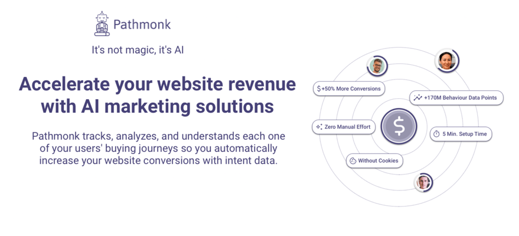
The next section presented the solution, clearly demonstrating how Pathmonk addressed each of the previously outlined issues. In this example:
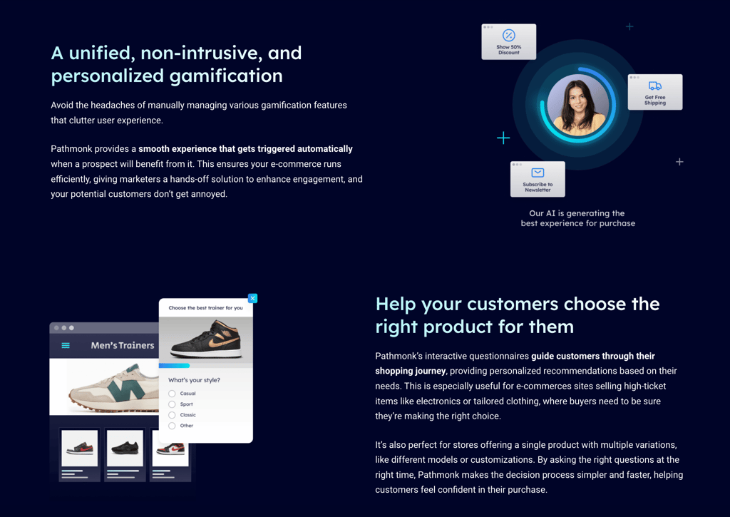
To counter a "generic e-commerce experience," we offered "personalized shopping experiences."
For "multiple gamifying items," we provided a "unified, non-intrusive, and personalized gamification approach."
To resolve "customers getting overwhelmed," Pathmonk helped "guide your customers to choose the right product."
This approach reinforced the shift from feature-based messaging to solution-driven outcomes. For instance, instead of simply highlighting the feature "qualifying funnel," (which nobody would have understood) the focus was on the benefit: "help your customers choose." It wasn’t about the how but about what you get.
The after:
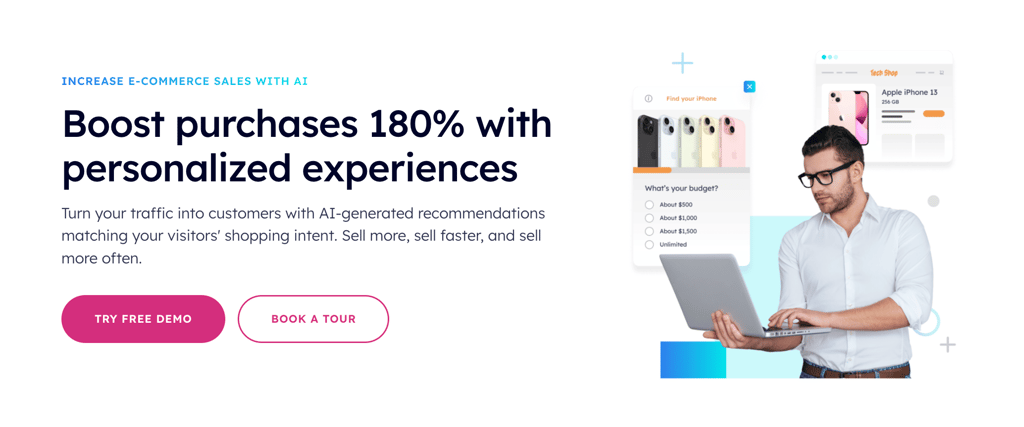
Every solution page started with a clear, SEO-friendly H1, such as "Increase e-commerce sales with AI.".
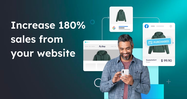
Outcome-driven headers, like "Boost purchases by 180% with personalized experiences," were used to immediately grab attention and connect with marketers’ goals.
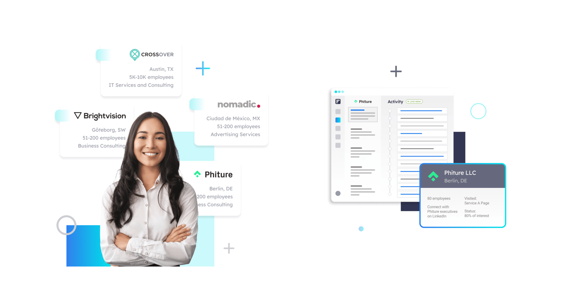
Each header was paired with an illustration that visually demonstrated how the product solved a specific pain point—for example, showing how personalized shopping experiences could increase e-commerce sales.
The visuals adopted a techy, modern aesthetic to better resonate with Pathmonk’s innovative positioning.
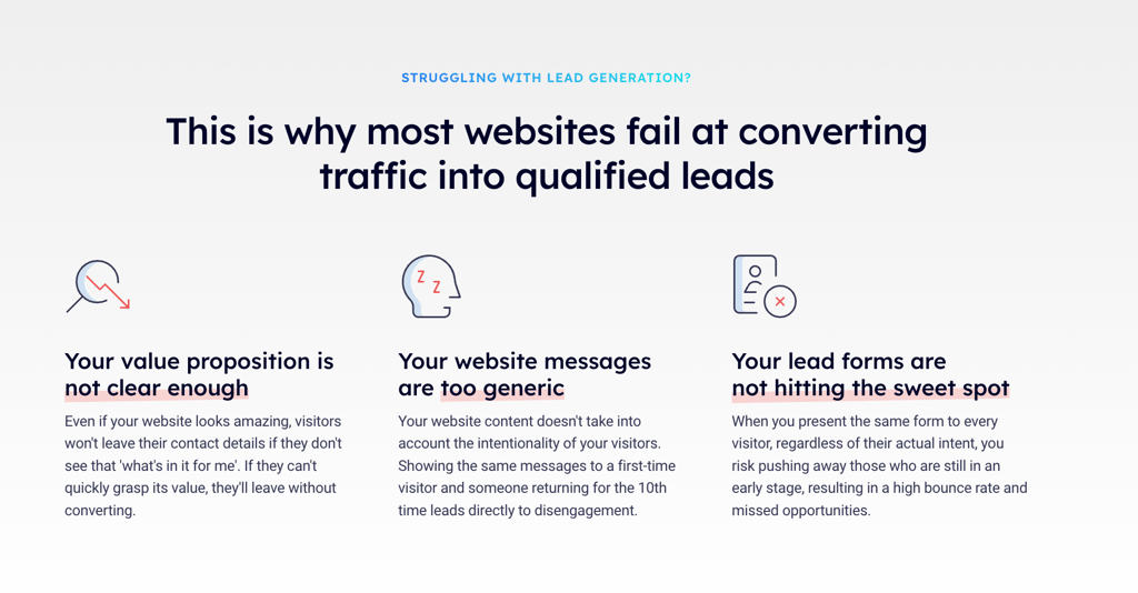
Every solution page began with a carefully crafted section that highlighted the key pain points marketers faced in a specific area. For example, when targeting e-commerce businesses, we identified that they were losing prospects primarily due to these challenges. The exact wording was farmed from Reddit (chef’s kiss) and user tests.
This section specifically was featured as one of the best SaaS landing pages examples by LandingRabbit “If you are thinking of adding one to one of your landing pages, Pathmonk provides a great example”
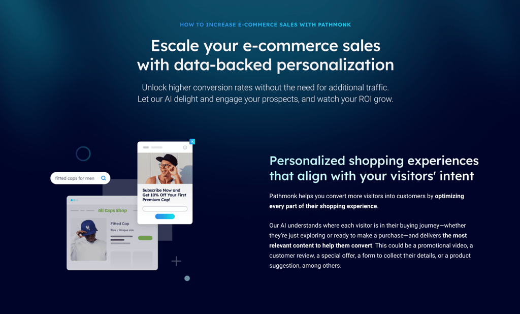
To enhance storytelling and improve targeting, I also developed six industry-focused landing pages tailored to specific sectors, along with eight feature-specific pages providing detailed technical information for prospects seeking deeper insights.
Naturally, all this work required the finishing touch: a complete redesign of the homepage. Over time, we would also update the secondary pages to align with the new approach.
Results
Demo requests grew by 67% within three months of launching the new messaging and landing pages. This surge was particularly notable in SaaS and e-commerce industries.
The new solution and industry-specific landing pages saw an average conversion rate increase of 42%. Pages targeting “Increase lead generation” and “Increase e-commerce sales” performed exceptionally well.
Sales teams reported a significant reduction in calls focused on explaining product features. Prospects arrived to meetings better informed, asking specific questions about implementation and outcomes, allowing the sales process to focus on closing deals rather than education.
Website-driven revenue increased by 74% in the first three months, with 60% of new deals originating from the website.
What I would have done differently
Being more assertive in advocating for change: Pathmonk’s initial focus was so heavily centred on the product itself that my first attempts to change this were rejected, which delayed the transition to a solution-oriented approach. In hindsight, I should have advocated more assertively for this transformation from the start.
Streamlining the internal rollout: While the external messaging was successfully revamped, it took a bit of time for Sales, Customer Support, and Marketing to fully get on the same page with the new approach. Don’t get me wrong—these teams are absolute champions—but the way we work internally made the alignment process slower than I’d hoped.
Having an in-house designer: This is more of a “nice to have”, but having an in-house designer would have been a game-changer. I know working for a startup means resources are limited, and our freelance designer gave us great flexibility, but having someone on the team full-time would have made it easier to execute changes more quickly and consistently.
